Pages

Showing posts with label Album Cover. Show all posts

Thursday, 6 October 2011

Analysing Album Artwork #3


The last album cover I have chosen to analyse is 'The Rolling Stones' cover for their ninth studio album 'sticky fingers' released in 1971. The album was also the first album release from the newely formed label ' Rolling Stones Records'.
The artwork for the album was thought up by Andy Warhol, photographed by Billy Name and designed by Craig Braunand features a cover image of a male's crotch wearing jeans on the front and the opposite on the back whilst inside was a photograph of the male wearing white cotton briefs. The front zipper featured a real working zip with a mock-up beltbuckle that pulled apart to reveal the insleeve of the vinyl record. The images were roumered to be of Mick Jagger although Warhol said otherwise and inside, 'Andy Warhol' was printed on the waistband of the briefs in the same typo as on the cover of 'The Velvet Underground's' first album.
I think that the image, although risky to print on an album cover (especially the size of an LP vinyl), would prove rewarding for the amount of publicity the band would get from it. I don't think that I will be re-creating this album although the idea of taking a mid-shot photo of a bodypart, and not the face of the artist, could be interesting so I think this could be somthing to keep in mind when designing my digipack and suring shooting. I think that this could also link to some of the extreme close-up shots of Rickie's face I have included in my animatic for the music video.I also like how a photograph is used on the cover and simply edited, the vintage 'look' of this image is something I could look into experimenting with on Photoshop.
I think that the grayscale photograph with the red and white fonts on the label and the band name and album title proves effective, applying to the three colour palette and keeping it simple.
I think that the 3D element of the zipper adds a huge interest to the cover as it makes it interactive to an audience, which in a strange way, might make a person want to buy the album. I think it also adds value to a collectors point of view.


Analysing Album Artwork #2

The second album cover I have chosen to analyse is the third studio album by music producer Mark Ronson entitled 'Record Collection' and released under the name 'Mark Ronson & The Buisiness Intl. in 2010.
The album artwork was created by Art Directors Gerard Saint and Mat Maitland which make reference to several famous album covers including 'Rio' by Duran Duran on the cover left to the centre. Click Here to see what I mean.
I think that the compilation of records, using different artwork, and creating a single image of the artist is a really nice idea. I like how amplification has been used to draw reference from existing records, perhaps this is something I could take into consideration.
I think the layout is really well done, as the album name and the artist is clear, although it almost looks like the floor of a teenagers bedroom and as if the album cases have 'fallen' into place. The white 'studio' background is something that I think adds to the cover and balances out the use of bright colours, making it not appear too busy.
I think that the colours used work well together, using hints of the same tones in each album cover in the compilation. This is something I believe I should definetly think about doing, as it almost has an influence from Warhol's artwork during the pop art movement in New York. Although the cover overall looks more '80's, I think that the idea is there and could work extremely well with the concept I have created.
I like how the typography isnt too obvious although is clear due to the placing of it, and I like how it is white on a darker background which makes it 'pop' to an audiences perspective on the shelves of a music store.
Because this is a modern album cover, I think it backs up my idea that the 'vintage look' is appealing to a younger audience and I should continue in the same direction.


Tuesday, 4 October 2011

Analysing Album Artwork #1


The Velvet Underground were an American rock band from formed in New York City in 1964, their best known members being John Cale and Lou Reed. The Band had little commercial success whilst together, although the band was named by critics as one of the most influential and crucial bands of the 1960's.
Andy Warhol became the Manager of the band who became the house band at the 'Factory' and played his 'Exploding Plastic Inevitable' events, which was a series of multimedia events organized by Warhol between 1966 and 1967. Warhol's management allowed freedom to the band to play whatever music they wanted, and their debut album 'The Velvet Underground & Nico' (featuring German singer Nico with whom they collaborated) was named the 13th Greatest Album of All Time by 'Rolling Stone' in 2003.
The Album cover for the bands debut album was a design by Warhol which featured a yellow banana with 'peel slowly and see' printed near a perforated tab. For those that removed the banana 'skin' discovered a peeled pink banana underneath.
Here is the album cover, I love the instant 'pop art' impact the cover gives as soon as you see it. I also think that the unusual aesthetic would draw in a persons attention on a cd or vinyl rack in a music store. I think that the child-like nature of the cover would relate directly to the childlike, simplistic first impression an audience may recieve from viewing a piece of  Andy's artwork. Therefore, this could represent Andy's influence on the group, making the Album cover also a piece of art, signing his name at bthe bottom of the image. The silkscreen effect also seems to resemble a stamp which could imply Andy's 'stamp' he put on the group with the debut image and the idea to collaborate with Nico.
The unusual and almost disjuncture effect that the image gives could relate to the unusual and provocative music the band produced, an intelectual indication to the genre on the cover of the album.
I believe that to produce my album artwork similarly to this would have an ideal link to the Warholian image that 'Rickie & the Islanders' have for their debut album and video for the leading track 'End of the Night'.

Monday, 3 October 2011

1960's Album Artwork.


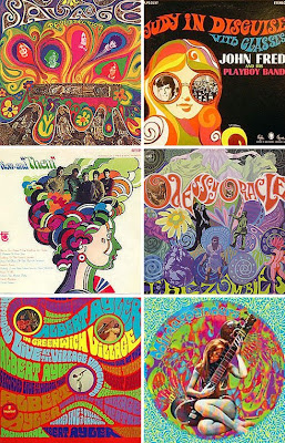
As the concept of the album and the band's aesthetic having a huge vintage influence, I thought it would be a good idea to research origional 1960's album artwork and apply the factors of album artwork from that era to my final digipack design.
I used 'bing' images to research album covers (vinyls) and these are some of the images I found, I can already see aspects of the artworks that I can use and evolve to fit my intented concept and apply to my intended audience.
I really like the arty feel of this vinyl cover by 'The Mothers of Invention', at first glance, I think that it has a real similarity to the 'DFifference Clouds' filter on Photoshop, which is something I think I could experiment with on the artwork, and have already done so on the temporary 'band banner' for my blog title.
However, I don't think that the overall aesthetic design of this album cover will bode well with my ideas although Andy Warhol's artwork holds similarities to this which would work better with the concept so perhapos I should do a post on his work and how his art could influence my design choices.


Here are some more examples I found of 1960's Artwork.

Monday, 19 September 2011

Album Cover Artwork ideas #1


I have been experimenting with photoshop for initial ideas for album artwork so I can get some ideas possibly before shooting etc.
I have taken an image of Rickie that I took on the shoot for 'Rebel' last year; a magazine 'for the fashion forward rockaholic'. I thought that his facial expression would look really effective if I edited it in Warhol's silk screen style. I believe that this would work well with my idea and vision for the band and the music video.
For this experimentation, I used one of the brush tools to draw over the outline of his face and add eyelashes, inspired by Edie Sedgewick. I feel that the androginy of the image is something that proves very interesting and I think I could also use this in my final digipack as it also has a comical aspect.
I searched for fonts on dafont.com, and came across this one called 'Revo'. I think that the font works extremely well with the band's name as it isnt too spaced out and almost looks like a band logo.
I also experimented with lighting, using the 'render' filters on photoshop, I think this adds a professional look to the overall Album artwork and is something I think would work on the final digipack.