Pages

Monday, 17 October 2011

Edie's 'Butterfly' Earrings.


Edie's Butterfly earrings, origionally designed by Steve Sasco Click Here , are famously related to Edie's signature image. There are many images of Edie wearing the earrings and I felt that they needed to be featured in the video.
Now, intead of paying £45 for them on ebay or amazon, I just opted for the cheaper option and DIY them myself.
On a trip to Leicester town, I went to Primark and found four pairs of 60's inspired earrings that I felt would look great through the lens of a camera. One pair in particular that I found were similar to that of the famous pair although after looking at them, it seemed simple enough to edit the design slightly with some tweezers and wire clippers.
Above, I have taken before and after images of the earrings to easily compare them, as well as an image of Catherine wearing them in an unintentional similar position to Edie in the image below it.
The last image is a movie still of Sienna Miller as Edie in the 2006 film 'Factory Girl'.


Location #3


Today was the second day of my media week, I went into Leicester town and one of the things I managed to do whilst I was there was take pictures of the third location for the music video.
I have not been to this location since I had the idea about filming there but it was as good as I remembered. The only thing I didnt think about was that the fountain would have water in it and therefore the band would not be able to climb on it which I featured in my animatic. Although, there is a statue there which I think could prove useful for those shots. The idea for the shot came from the film 'Factory Girl', a movie still shows this below.
The location is meant to be representative of Central Park in New York, this is hardly Central Park but I think the visual element will be there in the music video.
There are also a series of steps shown in the slideshare below which I think could prove useful for the walking shots of Rickie and one of the girls.

Sunday, 16 October 2011

Styling and Makeup (Girls)


Testing Out Editing Software and Styling of Catherine.


After testing out the makeup and hair styling of Catherine, I thought it would be a really clever idea to film a screentest almost, much like Andy Warhol would do with his actors before producing his underground films. I said to Catherine to 'channel Edie' and I think that she did a brilliant job with both locations. When filming, I wanted to test out the zoom and effect that the blur would give when I pressed the shutter button whilst zooming in and out on a subject. The loaded the footage into Adobe Premier Pro and began playing around with the software. The footage enabled me to learn and become confident with the programme in preperation for the real shoot. I then used Adobe After Effects to add lens flares and change the grain and curves of the footage in order to add a vintage effect, similar to the techniques used when filming and editing 'Factory Girl' Below are some footage stills I created in Adobe Premier from the video, I think that these show the most effective points of the video as well as inspire me to possibly involve stills inside my digipack, to link it to the music video.


Friday, 14 October 2011

Analysing Album Magazine Adverts #2

The second magazine album advert I have chosen to analyse is one for the Stone Roses' debut album.
At a first glance, the colour palette of the advert is bright which I think would be good in order to make readers look at the page in the magazine rather than skimming past.
The design of the artwork appears very arty with paint splatters which could imply a lively sound of the band.
The logos at the bottom of the advert; itunes, silvertone etc. add a professional aesthetic and authenticity to the album. I think that this could be a good techinique to use on my own album advert.
The band name stands out alot due to the font, colour scheme and placing of it. The fact that it is at the top of the page, I think, makes the band name the first thing that you see, from an audiences point of view when turning the page.
The ratings at the top of the page may influence audience members to buy the album, especially as they are both well known and well recieved music magazines, 'Q' and 'NME'. I like how they are places on badges, which adds a more casual approach to the 'look' and relates to band badges and the target audience the band is aimed at.

Thursday, 13 October 2011

Album Magazine Advert Draft #1

Analysing Album Magazine Adverts #3

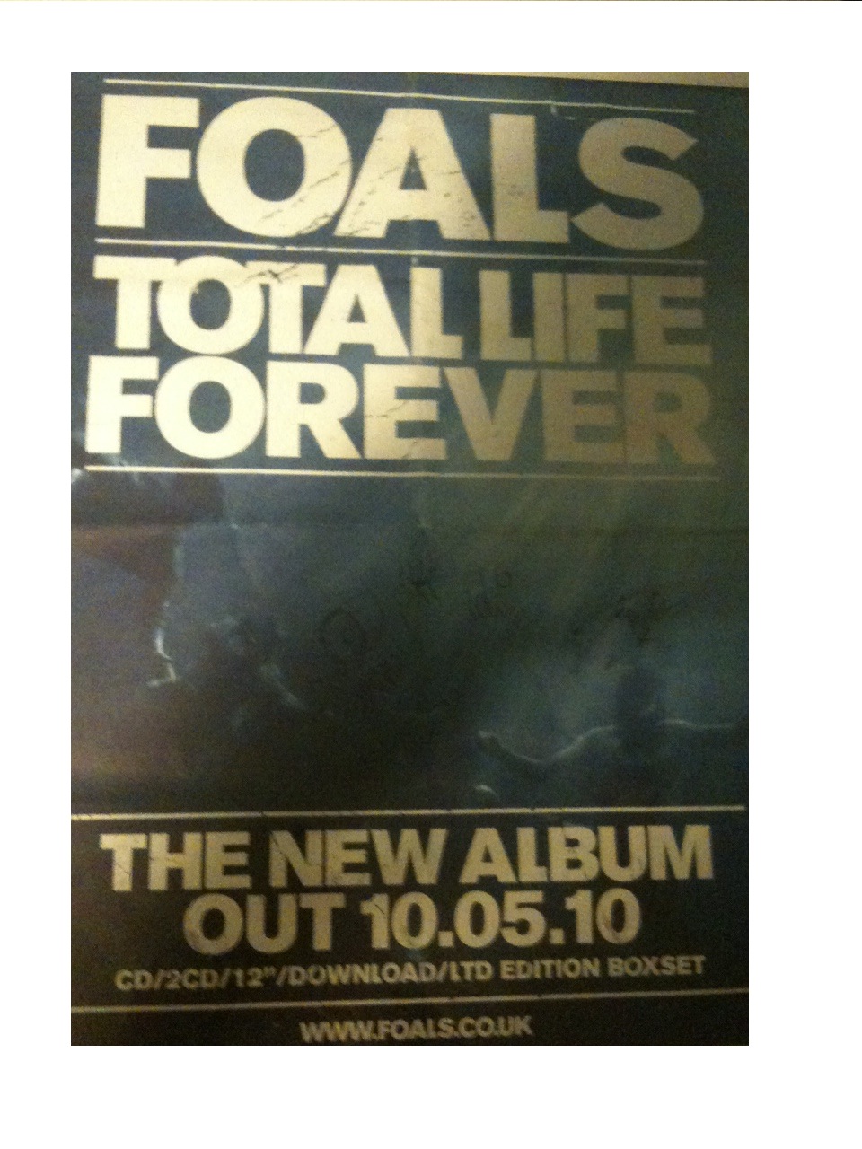
The third and last album advert I have chosen to analyse is this one for the 'Foals' album 'Total Life Forever'.
The main image on the advert is of the band underwater. Having no direct link to the band or the album, the image could suggest a disjuncture as well as the image being quite darkly lit, which allows the band name, date, and album title stand out more.
The text is a bold font that takes up most of the ratio of the page, at the top and bottom of the image, layered ontop. The text is all in upper case, implying importance which links to the fact that the album is a 'LTD EDITION BOXSET', shown at the bottom of the advert. The text is also printed in gold, which connotes importance, and links to the limited edition aspect.
There is very limited text on the page; just the band name at the top, the album name underneath, the release date, download details and website for the band. By doing this, the band gains a status in the magazine, even to some people who may not know of the band, who will recognize that they are a band they should be listening to.
The layout of the page also has importance. The way that the band and album title are boxed off as well as the release date, makes the text stand out even more, implying that the text is even more important than the image behind of the band.
I think that creating 'false status' through the use of minimising text on the advert could be a useful tool in the marketing of 'Rickie & the Islanders', as they are a new band formed from Rickielee's solo career and it would boost their customer appeal and artistic profile immediately. This is something I should most definetly think about ewhen creating the album advert for my digipack.