

Thursday, 13 October 2011
Analysing Album Magazine Adverts #3
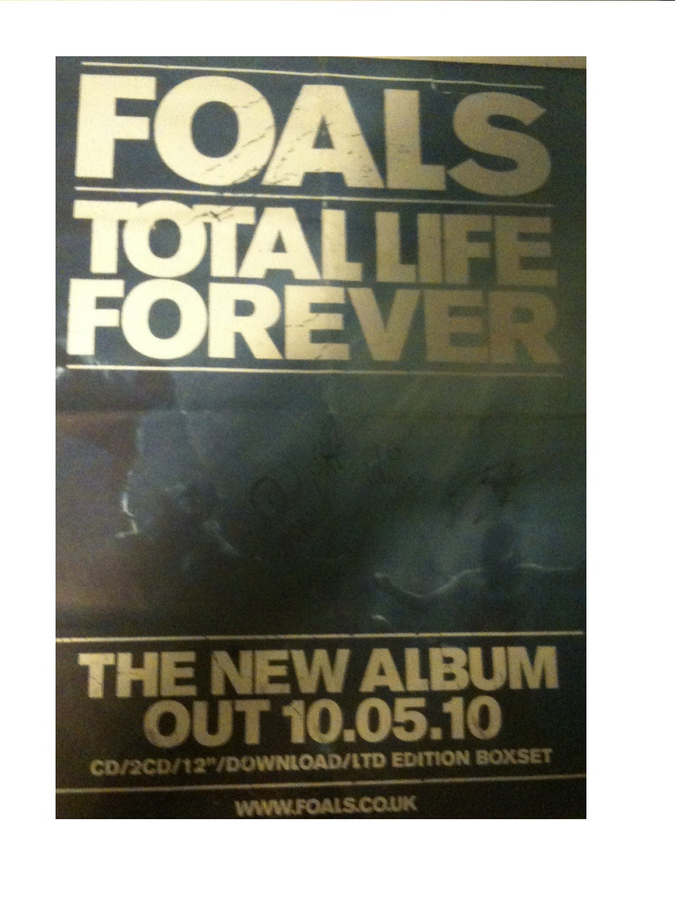
The third and last album advert I have chosen to analyse is this one for the 'Foals' album 'Total Life Forever'.
The main image on the advert is of the band underwater. Having no direct link to the band or the album, the image could suggest a disjuncture as well as the image being quite darkly lit, which allows the band name, date, and album title stand out more.
The text is a bold font that takes up most of the ratio of the page, at the top and bottom of the image, layered ontop. The text is all in upper case, implying importance which links to the fact that the album is a 'LTD EDITION BOXSET', shown at the bottom of the advert. The text is also printed in gold, which connotes importance, and links to the limited edition aspect.
There is very limited text on the page; just the band name at the top, the album name underneath, the release date, download details and website for the band. By doing this, the band gains a status in the magazine, even to some people who may not know of the band, who will recognize that they are a band they should be listening to.
The layout of the page also has importance. The way that the band and album title are boxed off as well as the release date, makes the text stand out even more, implying that the text is even more important than the image behind of the band.
I think that creating 'false status' through the use of minimising text on the advert could be a useful tool in the marketing of 'Rickie & the Islanders', as they are a new band formed from Rickielee's solo career and it would boost their customer appeal and artistic profile immediately. This is something I should most definetly think about ewhen creating the album advert for my digipack.
Subscribe to:
Posts (Atom)