Friday 28 October 2011
Thursday 27 October 2011
Filming Update.
I have completed the filming of the factory location with both Rickie and Catherine which is ready to be edited for my final draft although due to people being unavailable and the throwback that happened with Joanne not being able to film anymore has left me in a dilema.
The weather and time of year is also a huge set back as it is so uncertain with one day being sunny and another with pouring rain, which means that it is just impossible to film the park w/fountain location as everyone will get wet including my camera.
So, there is no alternative but to edit the first draft with shots from the animoto and filmed footage combined.
The studio location is also a dilema as I can't get a time when everyone is free to film, so therefore, I have discovered a studio hire that will allow us to film at nightime that I shall book for the earlier half of next week.
The good news is that we have a final member of the band! Sarah Jayne, who I used partly on the contents page for my media last year, will be featured in the studio 'band shots' as planned and possibly the park location which is a huge weight thats been lifted!
Monday 24 October 2011
Note to Examinor and Change of Direction.
Examinor,
I have recently encounted a problem with the filming and production of my music video. One of the members of 'band' is no longer able to take part in the music video due to family commitments that I was not aware of beforehand. Due to this poroblem, the filming of the video has been put a few days off of schedule.
Because of this, I have come up with the solution that until I can find an alternative band member, Catherine will represent the part of 'Edie' primarily and Rickie will represent 'Andy'. The new band member will only need to take part in the studio filming which I have booked for the early half of this week, allowing me time to edit the viodeo in time for the draft deadline this friday.
This problem is pushing the schedule quite tight but if this happened in industry, the production team would have to deal with it and finish the video in time for the release date.
Monday 17 October 2011
Location #2 - The 'Factory' Update.

So, yesturday, as the weather was nice, I thought it would be the perfect oppertunity to start the week-full-o-media by clearing out my garage for the 'factory' location.
I started to clear all of the clutter and stuff away, moving stuff we'd need in the future to the back of the garage, so that I could use the front part of the garage to use as the 'factory' and decorate.
I had painted the walls white beforehand, so that I would have a clean canvas to work with as well as the floor, which I should've done after as I had to wait for the floor to dry before covering the walls with tin foil.
At first, I was a bit apprehencious about putting foil on the walls as it might look a bit too make-shift, until I researched that the real Warhol factory was decorated with tin foil aswell, so I went aheadwith it. The result was pretty successful, all I need to do now is finish covering the walls, add lighting and we are sorted.

Below is an image still taken from 'Factory Girl' the film, I realised that to add realism to the location, I should cover some sort of piping with foil aswell to make the space look like a factory interior.

Edie's 'Butterfly' Earrings.


Edie's Butterfly earrings, origionally designed by Steve Sasco Click Here , are famously related to Edie's signature image. There are many images of Edie wearing the earrings and I felt that they needed to be featured in the video.
Now, intead of paying £45 for them on ebay or amazon, I just opted for the cheaper option and DIY them myself.
On a trip to Leicester town, I went to Primark and found four pairs of 60's inspired earrings that I felt would look great through the lens of a camera. One pair in particular that I found were similar to that of the famous pair although after looking at them, it seemed simple enough to edit the design slightly with some tweezers and wire clippers.
Above, I have taken before and after images of the earrings to easily compare them, as well as an image of Catherine wearing them in an unintentional similar position to Edie in the image below it.
The last image is a movie still of Sienna Miller as Edie in the 2006 film 'Factory Girl'.
Location #3

Today was the second day of my media week, I went into Leicester town and one of the things I managed to do whilst I was there was take pictures of the third location for the music video.
I have not been to this location since I had the idea about filming there but it was as good as I remembered. The only thing I didnt think about was that the fountain would have water in it and therefore the band would not be able to climb on it which I featured in my animatic. Although, there is a statue there which I think could prove useful for those shots. The idea for the shot came from the film 'Factory Girl', a movie still shows this below.
The location is meant to be representative of Central Park in New York, this is hardly Central Park but I think the visual element will be there in the music video.
There are also a series of steps shown in the slideshare below which I think could prove useful for the walking shots of Rickie and one of the girls.

Sunday 16 October 2011


Testing Out Editing Software and Styling of Catherine.
After testing out the makeup and hair styling of Catherine, I thought it would be a really clever idea to film a screentest almost, much like Andy Warhol would do with his actors before producing his underground films. I said to Catherine to 'channel Edie' and I think that she did a brilliant job with both locations. When filming, I wanted to test out the zoom and effect that the blur would give when I pressed the shutter button whilst zooming in and out on a subject. The loaded the footage into Adobe Premier Pro and began playing around with the software. The footage enabled me to learn and become confident with the programme in preperation for the real shoot. I then used Adobe After Effects to add lens flares and change the grain and curves of the footage in order to add a vintage effect, similar to the techniques used when filming and editing 'Factory Girl' Below are some footage stills I created in Adobe Premier from the video, I think that these show the most effective points of the video as well as inspire me to possibly involve stills inside my digipack, to link it to the music video.


Friday 14 October 2011
Analysing Album Magazine Adverts #2

The second magazine album advert I have chosen to analyse is one for the Stone Roses' debut album.
At a first glance, the colour palette of the advert is bright which I think would be good in order to make readers look at the page in the magazine rather than skimming past.
The design of the artwork appears very arty with paint splatters which could imply a lively sound of the band.
The logos at the bottom of the advert; itunes, silvertone etc. add a professional aesthetic and authenticity to the album. I think that this could be a good techinique to use on my own album advert.
The band name stands out alot due to the font, colour scheme and placing of it. The fact that it is at the top of the page, I think, makes the band name the first thing that you see, from an audiences point of view when turning the page.
The ratings at the top of the page may influence audience members to buy the album, especially as they are both well known and well recieved music magazines, 'Q' and 'NME'. I like how they are places on badges, which adds a more casual approach to the 'look' and relates to band badges and the target audience the band is aimed at.
Thursday 13 October 2011

Analysing Album Magazine Adverts #3
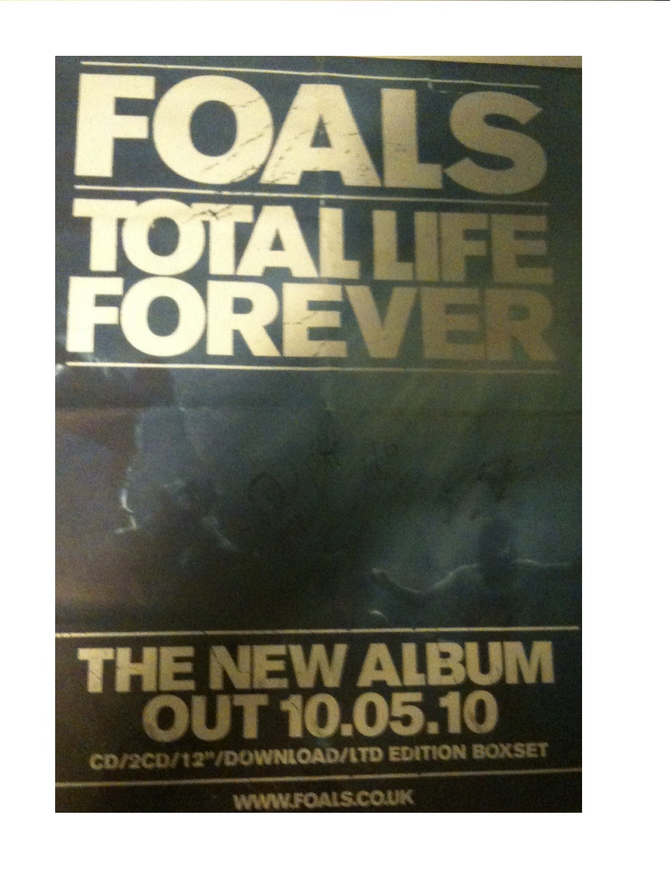
The third and last album advert I have chosen to analyse is this one for the 'Foals' album 'Total Life Forever'.
The main image on the advert is of the band underwater. Having no direct link to the band or the album, the image could suggest a disjuncture as well as the image being quite darkly lit, which allows the band name, date, and album title stand out more.
The text is a bold font that takes up most of the ratio of the page, at the top and bottom of the image, layered ontop. The text is all in upper case, implying importance which links to the fact that the album is a 'LTD EDITION BOXSET', shown at the bottom of the advert. The text is also printed in gold, which connotes importance, and links to the limited edition aspect.
There is very limited text on the page; just the band name at the top, the album name underneath, the release date, download details and website for the band. By doing this, the band gains a status in the magazine, even to some people who may not know of the band, who will recognize that they are a band they should be listening to.
The layout of the page also has importance. The way that the band and album title are boxed off as well as the release date, makes the text stand out even more, implying that the text is even more important than the image behind of the band.
I think that creating 'false status' through the use of minimising text on the advert could be a useful tool in the marketing of 'Rickie & the Islanders', as they are a new band formed from Rickielee's solo career and it would boost their customer appeal and artistic profile immediately. This is something I should most definetly think about ewhen creating the album advert for my digipack.
Wednesday 12 October 2011
Track titles for the Digipack.
To decide on other track names for the album, I went onto www.wikipedia.com and clicked on random article until I found suitable titles. Now I have to decide on which tracks will make the final cut.
- Cubic threefold
- Jacqueline Jones
- Diamond City (Up in the Sky)
- M8 Bridge to Nowhere
- Lady Cop & Papa Crook
- The Frank Show
- The Death Collector
- Mozart & Friends
- Fire from Heaven
- Box the Pony
- 1996 in the United Kingdom
- The Cotton Club
- Win or Lose
- Sleeping Cow
Tuesday 11 October 2011


Draft Digipack #1


This is the first Digipack that I have created for the album. I have been researching and downloading countless photos of the factory, Andy, and Edie and one image that I found of Andy that stands out alot to me is the one I have chosen to put on the cover here. I am really fascinated with how the multiple images of Andy's face have been layered together with the transparency lowered and I think that this is something I could easily do with shots of Rickie's face. I adjusted the curves of the image and exposure etc before adding a render filter of 'lens flare' , using two of the different lens flare types to give it this look. I think that the lens flare is relevant to the concept and has a reference to the art 'look' of warhol, relating to his films and photographs.
I then inverted the image and placed it on the inside left page. The inside right is an edited image of David Bailey in his studio, which is something I could include of Rickie and the girls on the shoot, taking movie stills perhaps.
The back cover of the Digipack is the same colour palette as the front, although I placed the image of andy side-on and reduced the transparency to 6% so that the image is slightly seen only.
I added the barcode and compact disk logo to add believability and added the album tracks on the back.
I think that by using the image of Andy three times, changing the way the image is portrayed adds continuity and almost relates to how Andy repeated silkscreen photographs of his 'superstars'.
Monday 10 October 2011
'Beyonce -Countdown' Analysing the music video and showing outside references.
I was browsing the internet yesterday when I came across the newly released video for Beyoncé's new track 'Countdown'. The immediate 60’s style and outside references made me think that the video has the same music video style as the one I am creating for Rickie & the Islanders as well as other aspects of the video that are inspiring and that I am most definitely going to think of including in the final video.
The split-screen shots used throughout the video are an editing style that became popular inn film and video production during the 1960’s which involved a visible division of the screen. Usually, this division was only in half, but several simultaneous images were also experimented with, creating an almost in-frame optical illusion.
This is a technique that I am going to try and experiment with during the editing process on Adobe After Effects, the shots being filmed in the studio, much like the ones shot of Beyoncé in the video for ‘Countdown’.
Outside references to celebrities and homage to choreography creates the video style of Amplification, which is what I am also trying to achieve with the Warholian influence in my music video. In the Beyoncé video, a not-so obvious homage is to Dutch choreographer, Anne Teresa De Keersmaeker. In the TubeChop clip below, you can see the choreography side-by-side which makes it clearly to see the homage.

The choreography and art direction also pays homage to iconic films such as ‘West Side Story’ and ‘Funny Face’ starring Audrey Hepburn whereby the costume and styling reference is almost exact as well as paying choreographic homage to the beatnik dance scene. I also found another link and use of the ‘Audrey Dance’ on a TV commercial for ‘Gap’ that has been aired previously and posted it below. The outside reference to Audrey Hepburn is much like what I am trying to do when styling the band inspired by Edie and Andy. By finding this video, I feel a lot more confident in my ideas for the video as this almost backs them up and allows me to see that it can be done well and not in a ‘copycat’ manner.
Thursday 6 October 2011
Analysing Album Magazine Adverts #1

Here is the first magazine advert I have chosen to analyse, 'Florence and the Machine- Lungs'.
First of all, the image of Florence Welch intrigues me as an audience as the mise-en scene seems unusual at a glance. I really like the use of the lung necklace as although seeming whimsical, relates directly to the title of the album. The lung necklace is also in direct alignment with the title 'LUNGS' which is a clever editing technique from the art directors. The mise en scene of the image and the way Florence is dressed immediately signifies her 'look' and as this is the first album from 'Florence & the Machine' allows fans to identify her artistic style and star image.
I think that the fact that the image is centred and takes up the majority of the layout on the page adds to the adverts aesthetic appeal and would make the image stand out on the page of a magazine. The ratio of text to image is good I think as the text is mostly in a smaller font which doesnt distract from the image.
I like the classic typography on the page and how the date is just typed '6.7.09', almost implying that the date needs no description to its significance and increases the importance of the band, creating a status that hasn't been created as to yet.
However, I dislike how dark the colour scheme is surrounding the image and I think that I want my advert to be slightly less deep and more art based.
Analysing Album Artwork #3

The last album cover I have chosen to analyse is 'The Rolling Stones' cover for their ninth studio album 'sticky fingers' released in 1971. The album was also the first album release from the newely formed label ' Rolling Stones Records'.
The artwork for the album was thought up by Andy Warhol, photographed by Billy Name and designed by Craig Braunand features a cover image of a male's crotch wearing jeans on the front and the opposite on the back whilst inside was a photograph of the male wearing white cotton briefs. The front zipper featured a real working zip with a mock-up beltbuckle that pulled apart to reveal the insleeve of the vinyl record. The images were roumered to be of Mick Jagger although Warhol said otherwise and inside, 'Andy Warhol' was printed on the waistband of the briefs in the same typo as on the cover of 'The Velvet Underground's' first album.
I think that the image, although risky to print on an album cover (especially the size of an LP vinyl), would prove rewarding for the amount of publicity the band would get from it. I don't think that I will be re-creating this album although the idea of taking a mid-shot photo of a bodypart, and not the face of the artist, could be interesting so I think this could be somthing to keep in mind when designing my digipack and suring shooting. I think that this could also link to some of the extreme close-up shots of Rickie's face I have included in my animatic for the music video.I also like how a photograph is used on the cover and simply edited, the vintage 'look' of this image is something I could look into experimenting with on Photoshop.
I think that the grayscale photograph with the red and white fonts on the label and the band name and album title proves effective, applying to the three colour palette and keeping it simple.
I think that the 3D element of the zipper adds a huge interest to the cover as it makes it interactive to an audience, which in a strange way, might make a person want to buy the album. I think it also adds value to a collectors point of view.
Analysing Album Artwork #2

The album artwork was created by Art Directors Gerard Saint and Mat Maitland which make reference to several famous album covers including 'Rio' by Duran Duran on the cover left to the centre. Click Here to see what I mean.
I think that the compilation of records, using different artwork, and creating a single image of the artist is a really nice idea. I like how amplification has been used to draw reference from existing records, perhaps this is something I could take into consideration.
I think the layout is really well done, as the album name and the artist is clear, although it almost looks like the floor of a teenagers bedroom and as if the album cases have 'fallen' into place. The white 'studio' background is something that I think adds to the cover and balances out the use of bright colours, making it not appear too busy.
I think that the colours used work well together, using hints of the same tones in each album cover in the compilation. This is something I believe I should definetly think about doing, as it almost has an influence from Warhol's artwork during the pop art movement in New York. Although the cover overall looks more '80's, I think that the idea is there and could work extremely well with the concept I have created.
I like how the typography isnt too obvious although is clear due to the placing of it, and I like how it is white on a darker background which makes it 'pop' to an audiences perspective on the shelves of a music store.
Because this is a modern album cover, I think it backs up my idea that the 'vintage look' is appealing to a younger audience and I should continue in the same direction.
Tuesday 4 October 2011
Analysing Album Artwork #1

Andy Warhol became the Manager of the band who became the house band at the 'Factory' and played his 'Exploding Plastic Inevitable' events, which was a series of multimedia events organized by Warhol between 1966 and 1967. Warhol's management allowed freedom to the band to play whatever music they wanted, and their debut album 'The Velvet Underground & Nico' (featuring German singer Nico with whom they collaborated) was named the 13th Greatest Album of All Time by 'Rolling Stone' in 2003.
The Album cover for the bands debut album was a design by Warhol which featured a yellow banana with 'peel slowly and see' printed near a perforated tab. For those that removed the banana 'skin' discovered a peeled pink banana underneath.
Here is the album cover, I love the instant 'pop art' impact the cover gives as soon as you see it. I also think that the unusual aesthetic would draw in a persons attention on a cd or vinyl rack in a music store. I think that the child-like nature of the cover would relate directly to the childlike, simplistic first impression an audience may recieve from viewing a piece of Andy's artwork. Therefore, this could represent Andy's influence on the group, making the Album cover also a piece of art, signing his name at bthe bottom of the image. The silkscreen effect also seems to resemble a stamp which could imply Andy's 'stamp' he put on the group with the debut image and the idea to collaborate with Nico.
The unusual and almost disjuncture effect that the image gives could relate to the unusual and provocative music the band produced, an intelectual indication to the genre on the cover of the album.
I believe that to produce my album artwork similarly to this would have an ideal link to the Warholian image that 'Rickie & the Islanders' have for their debut album and video for the leading track 'End of the Night'.
Monday 3 October 2011
1960's Album Artwork.
As the concept of the album and the band's aesthetic having a huge vintage influence, I thought it would be a good idea to research origional 1960's album artwork and apply the factors of album artwork from that era to my final digipack design.
I used 'bing' images to research album covers (vinyls) and these are some of the images I found, I can already see aspects of the artworks that I can use and evolve to fit my intented concept and apply to my intended audience.
I really like the arty feel of this vinyl cover by 'The Mothers of Invention', at first glance, I think that it has a real similarity to the 'DFifference Clouds' filter on Photoshop, which is something I think I could experiment with on the artwork, and have already done so on the temporary 'band banner' for my blog title.
However, I don't think that the overall aesthetic design of this album cover will bode well with my ideas although Andy Warhol's artwork holds similarities to this which would work better with the concept so perhapos I should do a post on his work and how his art could influence my design choices.

Here are some more examples I found of 1960's Artwork.
Animatic.
Here, I have created an animatic from my storyboard for the music video to 'End Of the Night'.
When storyboarding, I wanted to use post-its to create each shot as I had ideas in my head of the shots I wanted to use but I was unsure as to the order I wanted to place them in. So, because of this, I used post-its so that I could re-arrage shots until I was happy with the final result.
I also thought it would be a good idea to use three different colours of post-its to determine the three locations to avoid confusion in the animatic of where each shot would be filmed, especially during the faster editing.
I decided to use a beige colour for the studio location, the lighter green for the park location and the darker green for the 'factory'.
Some shots are used more than once as I wanted to use multiple shots using the same techniques and camera angles which I believe will add continuity and link the locations together.
I used Windows Movie Maker to produce my animatic which I found hard at times due to the program crashing a lot of the time which became fustrating and time consuming.
Subscribe to:
Posts (Atom)